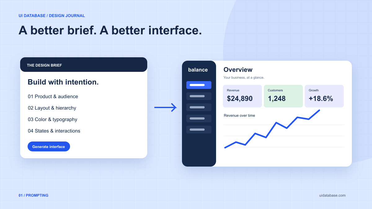
1. Start with the user’s task, not a style adjective
Compare “Build a modern dashboard” with “Build an overview for a freelance designer who needs to see overdue invoices and collect payment.” The second brief identifies a decision the interface must support. That gives you a reason to emphasize overdue balances instead of filling the top row with arbitrary statistics.
Write down the audience, the job they came to do, and the action that should be easiest to find. Include the actual content when you have it. A realistic project name, long customer name, and empty list reveal layout problems that a screen full of short placeholders will hide.
2. Translate what you like into concrete instructions
You can describe an interface without knowing every professional term. “A narrow menu on the left that stays visible on desktop” is more actionable than “great navigation.” “A large headline with a short supporting sentence and one button” establishes hierarchy without requiring a typography vocabulary.
Choose a few visual rules that work together. Specify the page background, the main text color, one action color, spacing between sections, and the relationship between headings and body text. If you supply a visual reference you are allowed to use, identify which parts matter; otherwise the assistant may imitate details that do not fit your product.
- Layout: a centered reading column, a split hero, or a sidebar with a wider content area.
- Typography: restrained sans-serif body text, larger headings, and tabular numbers for financial values.
- Surfaces: thin borders and flat backgrounds, or subtle shadows—state where each belongs.
- Density: compact operational controls or a spacious page intended for reading.
3. Use a reusable UI prompt template
Replace the bracketed parts before copying this brief. Keep it specific to one screen, and tell the assistant to use your existing components before adding a new design system. This is a starting template, not a guarantee of a particular model’s output.
Build [screen] for [audience]. Their main task is [task], and the primary action is [action].

Project: use [framework], the existing components, and the current routing conventions. Do not introduce dependencies without a clear need.
Content: [real headings, labels, example records, and actions].
Layout: [page structure, content width, navigation, and section order].
Visual direction: [background], [text color], [one accent], [type hierarchy], [spacing], and [border/radius rules].
Responsive behavior: [what stacks, collapses, or scrolls on smaller screens]. Keep the primary action easy to reach.
States: include loading, empty, error, success, hover, and keyboard focus where relevant. Explain what each action does.
Accessibility: use semantic HTML, labeled inputs, visible focus, and meaningful button text. Do not communicate status through color alone.
Scope: implement [in-scope behavior]. Clearly label demo data and do not imply a real backend exists.
Before finishing: check long content, keyboard navigation, and a narrow mobile layout. Report any unfinished behavior.
4. Refine one problem at a time
When the first result misses, identify the mismatch rather than asking for “more premium.” Try “The summary cards compete with the overdue list. Reduce their emphasis and make the list the first content section.” That instruction connects a visible problem to an intended outcome.
Keep useful decisions stable between iterations. Ask for a change to the sidebar density without changing the palette, or revise the type hierarchy without restructuring the whole page. If the assistant changes too much, explicitly list the parts to preserve in the next request.
5. Judge the working interface, not just the screenshot
A screenshot can show alignment and hierarchy. It cannot establish that filters work, focus is visible, or an error is explained. Walk through the main task with the keyboard and with deliberately awkward content. Try an empty dataset and a slow request as well as the ideal state.
For responsive behavior, ask how the content should reorganize rather than supplying only a list of device sizes. web.dev’s responsive design guidance explains flexible layouts and choosing breakpoints to suit the content. After reviewing the result, keep the successful brief as the starting point for related screens.
Further reading: responsive web design basics