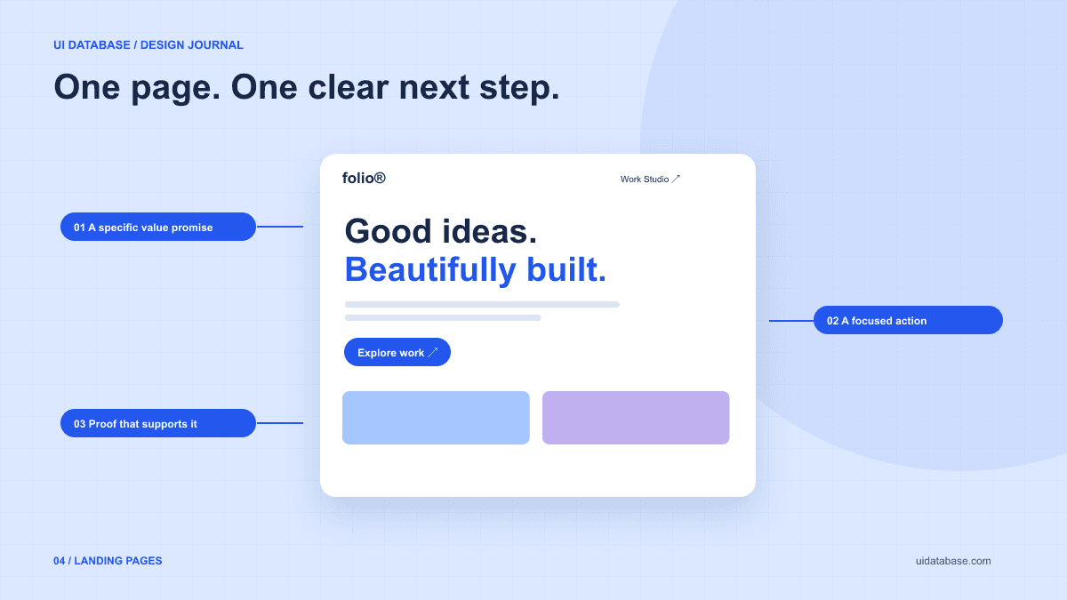
Write the offer in one concrete sentence
Use a simple structure: “This product helps this audience do this task.” For UI Database, that might be “A visual library helps builders describe a UI to their AI coding tool.” That tells us to show a design alongside the language used to describe it, rather than opening with a broad claim about productivity.
Choose a primary action that the product can actually support. Browse the library, try a demo, and book a call represent different levels of commitment. Do not advertise instant access if the next screen is a waitlist. Explain what the visitor gets after taking the action.
Arrange sections around the visitor’s questions
A useful sequence answers: What is this? Is it relevant to me? How does it work? What do I get? What might stop me from using it? The order can vary, but each section should add information rather than repeat the headline in different words.
For a visual product, show a representative example early. For a service, show a concrete deliverable or describe the process. Use customer quotes only when they are real and you have permission to use them. If the product is new, a clear demonstration is more honest than invented social proof.
- Hero: a specific promise, a short explanation, a primary action, and a representative example.
- Workflow: what the visitor does and what the product returns.
- Details: the features or constraints needed to decide whether it fits.
- Objections: pricing, prerequisites, limitations, and useful FAQs.
- Closing action: the same clear next step, now supported by the page.
Use this adaptable landing-page prompt
Supply real copy and a real destination for the main button. The assistant should ask for missing product facts instead of filling the page with invented customer counts. The example below preserves room for a distinctive visual direction without prescribing the same layout for every business.
Build a responsive landing page for [product], which helps [audience] accomplish [specific task]. The primary action is [action], linking to [existing route or destination].

Use these verified product facts: [facts]. Use this actual example or demo: [example]. Do not invent reviews, logos, usage numbers, pricing, or capabilities.
Hero: lead with a concrete headline and a short explanation. Show the product example early. Give the primary action prominence and keep secondary links quieter.
Content order: explain what the product does, show the workflow, cover decision-relevant details, answer genuine objections, and repeat the main action. Avoid redundant feature grids.
Visual direction: cool white, navy, and cobalt blue; clear sans-serif body text; an expressive but readable headline; generous spacing; thin borders. Vary layout only when the content benefits from it.
Functionality: every link must resolve. Forms need visible labels, useful validation, a pending state, and a real success or failure response. Do not simulate a successful submission without a backend.
Responsive and accessibility: reorganize content for narrow screens, retain visible focus, use semantic headings, and respect reduced-motion preferences. Check zoom and long text.
Search metadata: write a concise title and description that accurately describe this offer. Keep existing public URLs when redesigning.
Deliver the working page and list any missing product facts or integrations.
Ask only for what the next step needs
If the visitor can explore without creating an account, a browsing action can demonstrate value before asking for a commitment. If a consultation requires contact details, explain what happens after the form is submitted. Avoid adding fields solely because another landing page includes them.
A form is not complete when its inputs look aligned. Provide labels and errors that identify the affected field and explain how to correct the problem. W3C’s form-notification guidance includes associating errors with controls. Preserve the user’s input after a failed request where appropriate.
Further reading: accessible form notificationsTreat conversion as something to measure
No prompt can guarantee a conversion rate. A redesign changes a hypothesis about what visitors understand and trust. Define the event that matters—such as starting a demo or submitting a qualified inquiry—before judging the result.
Review the complete path from the page to that event. A prominent button will not solve a broken sign-up flow. When comparing versions, account for traffic source and visitor intent; a person searching for game screenshots may not want a web UI prompt library. Keep the page accurate for the audience it actually serves, and use evidence from real visits to guide the next iteration.