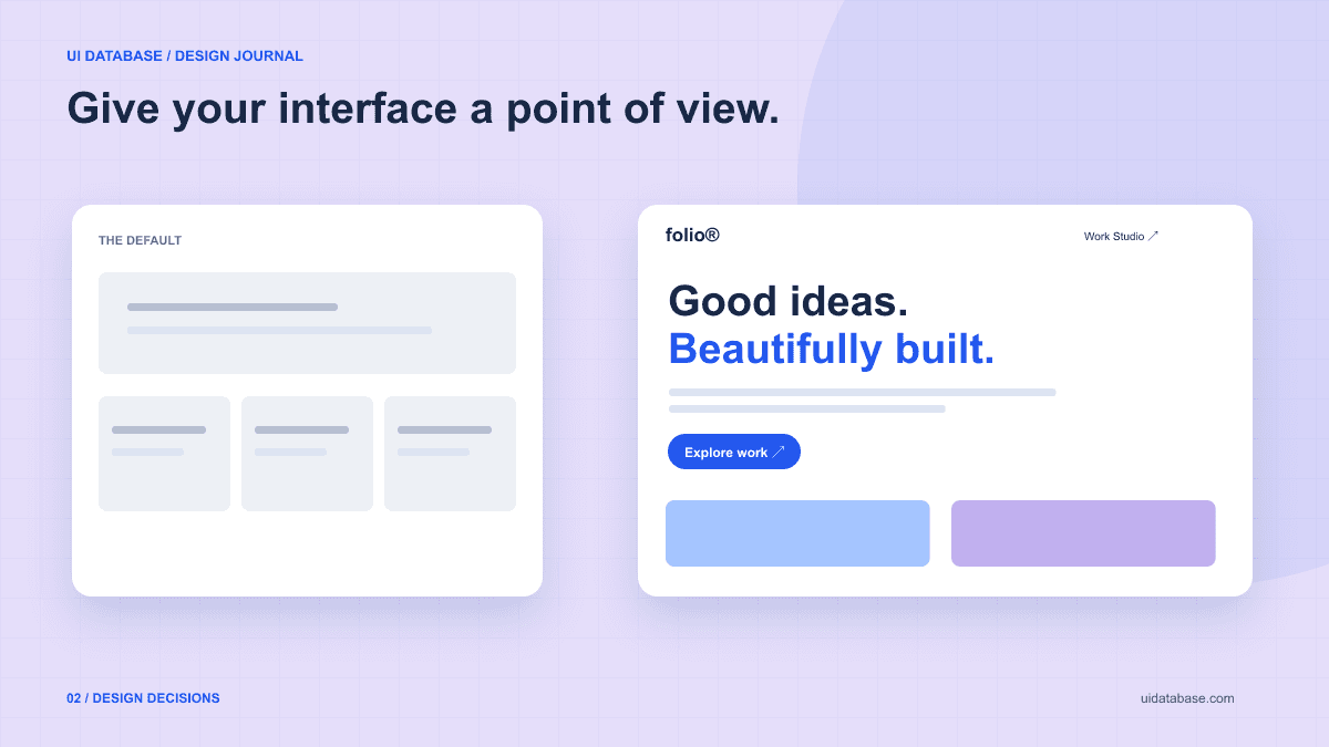
Diagnose the page before changing its colors
Ask what someone should understand within the first screen. For a UI inspiration library, seeing the interfaces is part of understanding the product. For an invoicing tool, a clear picture of how invoices get paid may be more useful. Start by making the central value visible instead of writing a longer list of features.
Look at the page without its logo. If its imagery, section headings, and sample content could describe a dozen unrelated businesses, the problem is larger than the accent color. Replace abstract claims with an example of the actual thing a visitor will use.
Choose one visual direction with a few firm rules
A direction can be quiet and practical, expressive and editorial, or dense and operational. These are design choices, not quality rankings. A settings screen does not need a dramatic headline just because a portfolio benefits from one.
For an editorial portfolio, you might choose a blue canvas, oversized type, a single abstract illustration, and an asymmetric project grid. For a business dashboard, you might prefer neutral surfaces, tightly aligned numbers, and a restrained accent. Both can be distinctive when the choices are consistent.
- Pick one element to lead: typography, product imagery, or a distinctive composition.
- Set a small palette and assign a purpose to every color.
- Use spacing to group related information, not merely to make the page taller.
- Give repeated elements a shared border, radius, and type treatment.
Change the structure when the content calls for it
Not every benefit needs its own card. A short explanation next to a working example can be more informative than three boxes containing nearly identical claims. A sequence of steps fits a process; a comparison fits a decision; a gallery fits visual exploration.
Vary section layout with a reason. If every section alternates randomly, the page becomes harder to scan. Use a clear progression: show the product, explain how it works, answer objections, then offer the next action. Remove sections that repeat what the reader already knows.
A prompt for a more intentional redesign
Use this after identifying the specific problem in the existing page. Replace the bracketed items, and include the current code or page context in your assistant. Keeping functionality in scope prevents a visual refresh from silently removing useful behavior.
Refine the existing [page] for [audience]. The main task is [task]. Preserve existing routes, content, form behavior, and working integrations.

The current design feels generic because [specific visible issue].
Adopt this visual direction: [direction]. Use [palette], [type hierarchy], and [spacing/border rules].
Lead with [real product example or content]. Organize the remaining sections around the user's questions: [questions in order]. Remove repeated claims, but do not invent testimonials, customer logos, or performance numbers.
Avoid giving every paragraph a card. Choose layout based on the content's role. Keep one clear primary action and visually quieter secondary links.
Use subtle motion only where it clarifies a transition, and respect reduced-motion preferences. Preserve readable contrast and visible keyboard focus.
Check the narrow-screen composition, long headings, and all existing interactions. Explain the main design choices and any behavior that could not be preserved.
Review with real content and a clear stopping point
Replace placeholder text before deciding whether the layout works. A two-word headline may look elegant but hide the real positioning; a wall of promotional copy may conceal a weak hierarchy. Write what the product does, who it helps, and what a visitor can do next in plain language.
Check the main action without relying on color alone. Check that links remain recognizable, headings have a logical order, and the page still works when zoomed. W3C’s Easy Checks is a useful first review for these accessibility concerns, although it is not a complete audit.
Stop when the page communicates its purpose, the visual rules are coherent, and the main task is usable. Adding another decoration rarely solves a missing product explanation. The goal is a recognizable and useful design—not novelty in every component.
Further reading: W3C accessibility Easy Checks