Give every metric a job
For a freelancer checking cash flow, available balance, overdue invoices, and upcoming expenses may be useful. For a support manager, open conversations and response times could matter more. Do not reuse a finance dashboard’s metrics just because its composition looks good.
For each metric, write a name, a definition, a unit, a time period, and a possible action. “Revenue” without a date range or a definition of refunds can be misleading. Specify whether a change is relative to the previous week, month, or another comparison period. Demo values should be clearly identified as examples.
Separate orientation, summary, and action
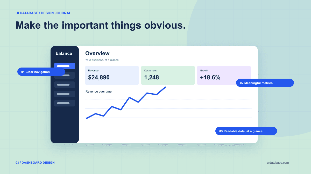
A sidebar provides orientation across the product. A page heading and date range explain the current view. Summary metrics establish the situation, while a list of exceptions or recent activity supports the next action. This gives the assistant a hierarchy to implement rather than a blank request for a dashboard.
Use a chart to answer a question about change or comparison. If the important task is reviewing individual invoices, a table may deserve more space than the chart. Keep labels, units, and a text explanation available so the visual is not the only way to understand the information.
Copy this finance-dashboard build prompt
The following brief is for a fictional workspace, with illustrative data and no financial integration. Replace its records and metrics with definitions that match your product. It is intended for a coding assistant, not an image generator.
Build a responsive SaaS finance overview for a freelancer in the existing React app. Use existing UI components and CSS conventions.

Purpose: identify overdue payments and understand this month's cash flow. Clearly label all records as demo data.
Layout: left navigation for Overview, Invoices, Clients, and Settings. In the main area, place a heading and date range first, three summary metrics next, an overdue-invoices list, then a cash-flow chart and recent transactions.
Metrics: show collected income, paid expenses, and net cash flow for the selected period. Calculate all displayed totals from the same demo records. Define net cash flow as collected income minus paid expenses. Do not label this account balance.
Visual direction: cool white surfaces, navy text, one blue action color, thin borders, consistent spacing, and tabular numerals. Keep decorative shadows restrained.
Behavior: date filters update every dependent metric and chart. Invoice status filtering includes a reset action and a useful empty state. Provide meaningful destinations or clearly disabled unavailable actions.
States: loading skeleton, an error with retry, no transactions yet, no matching invoices, and overdue invoices with text status labels.
Responsive: turn navigation into a labeled menu on narrow screens. Stack metrics when they no longer fit. Keep tables in their own horizontal scroll container; never force the whole page to scroll sideways.
Accessibility: semantic table headings, labeled controls, visible keyboard focus, and a text summary for the chart. Include currency and period labels. Verify that totals remain consistent after filtering.
Test the numbers as well as the layout
An attractive dashboard can be internally inconsistent if each widget has separately invented data. Use a shared dataset and derive totals from it. Confirm that changing the time range updates all affected displays, and explain which widgets intentionally use a different period.
Try a record on the boundary between two months, a negative adjustment, and an empty range. Specify the reporting timezone if timestamps can fall on different dates for different users. Keep currency formatting explicit, and do not sum different currencies without a defined conversion rule.
Make the small-screen view a deliberate decision
Simply shrinking every panel creates a miniature desktop screen. On mobile, prioritize the heading, key metric, and urgent actions. Secondary comparisons can move lower on the page. A complex table may need a contained scroll area or a focused record list rather than smaller type.
Choose layout breakpoints by looking at where content becomes cramped. web.dev describes this content-led approach to responsive design. Test long client names, translated labels, large values, and keyboard navigation before accepting the result. A polished empty state should explain how data will appear, not just display a blank chart.
Further reading: content-led responsive layouts